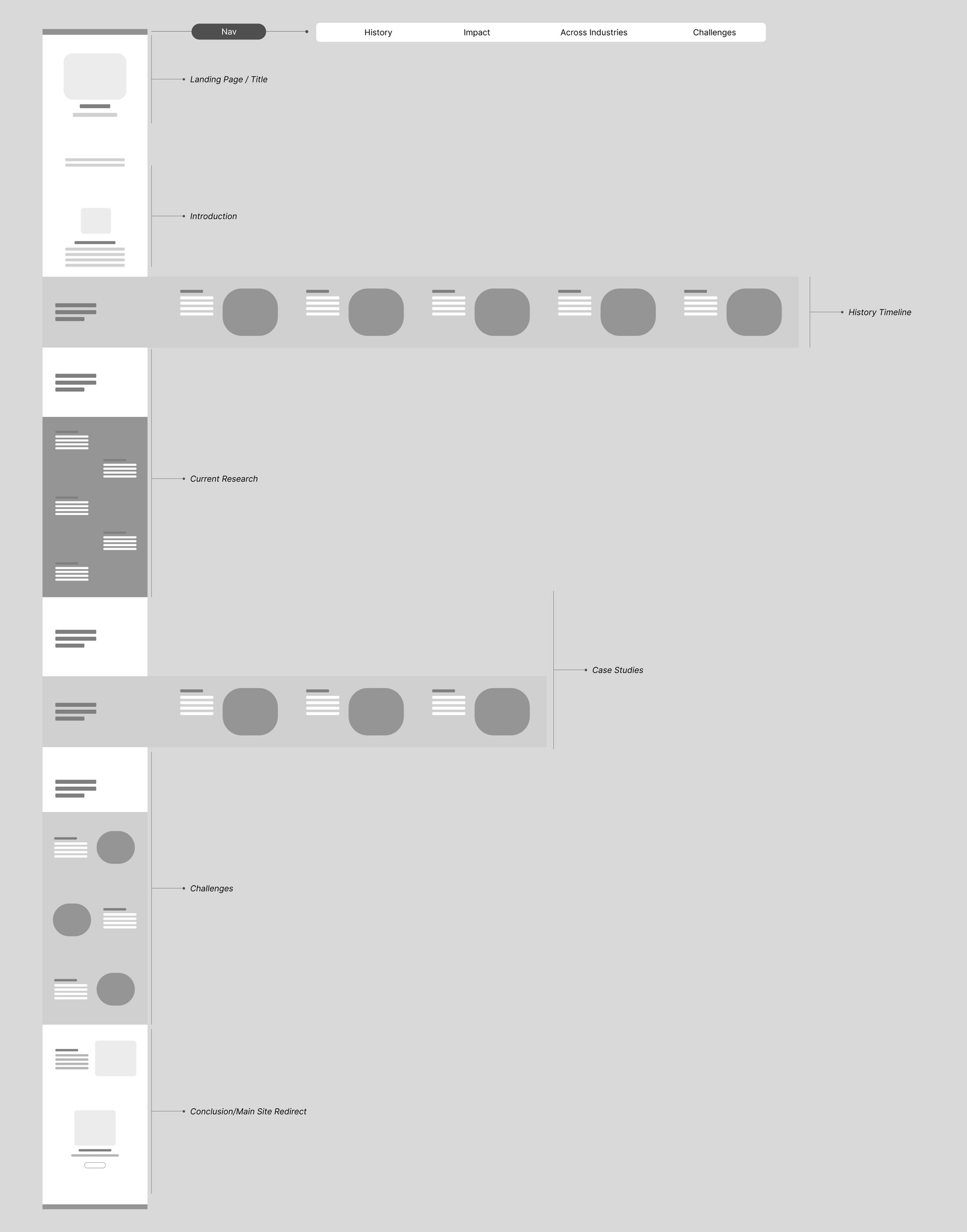
In the initial stage, we set objectives, created compelling content, and gathered resources. Despite the vast online information about the Surgical Safety Checklist, we've condensed key points to inform readers without overwhelming them. Our primary aim was to design an experimental user experience that's intuitive, encourages seamless navigation, and entices users to explore the entire page.
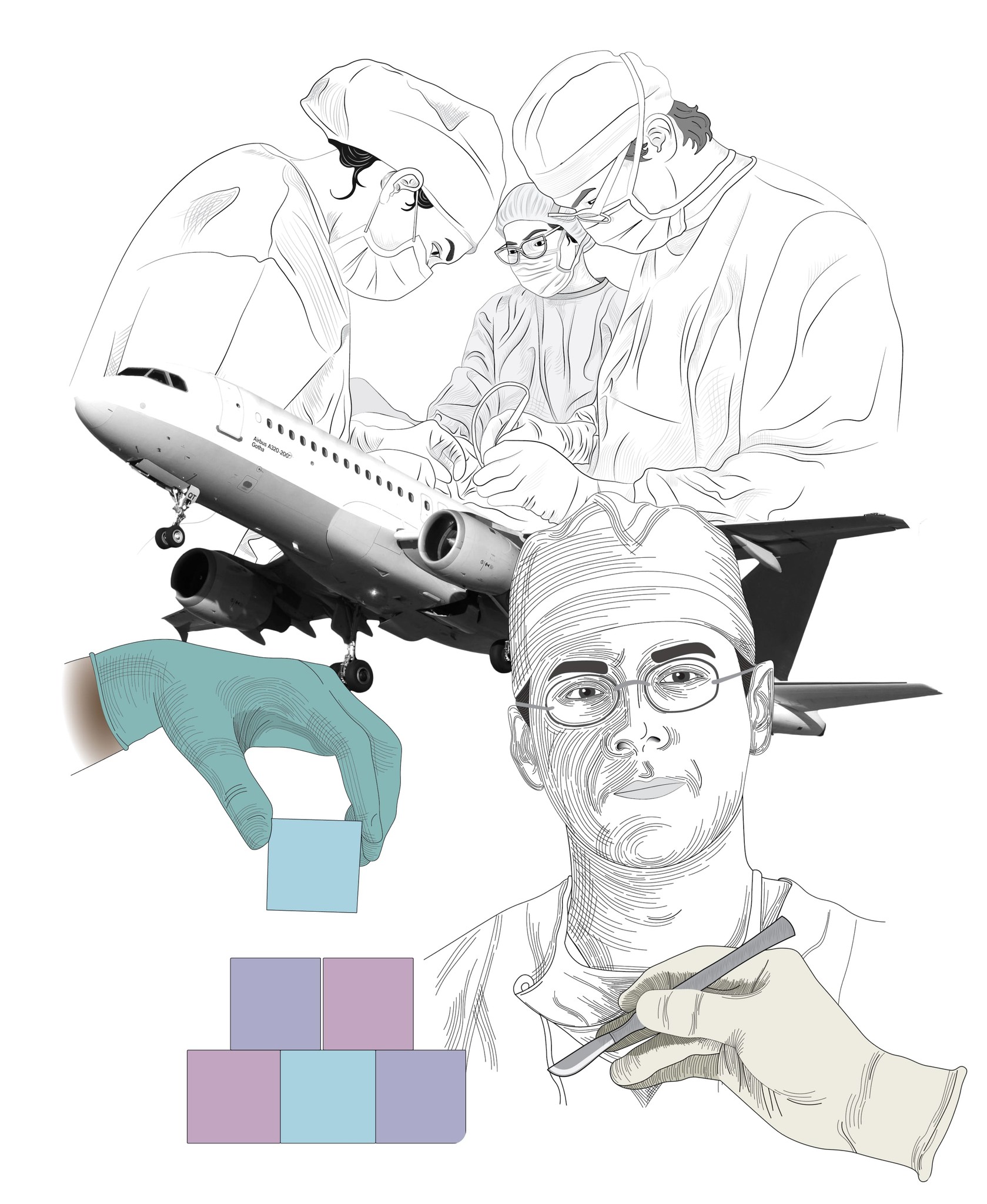
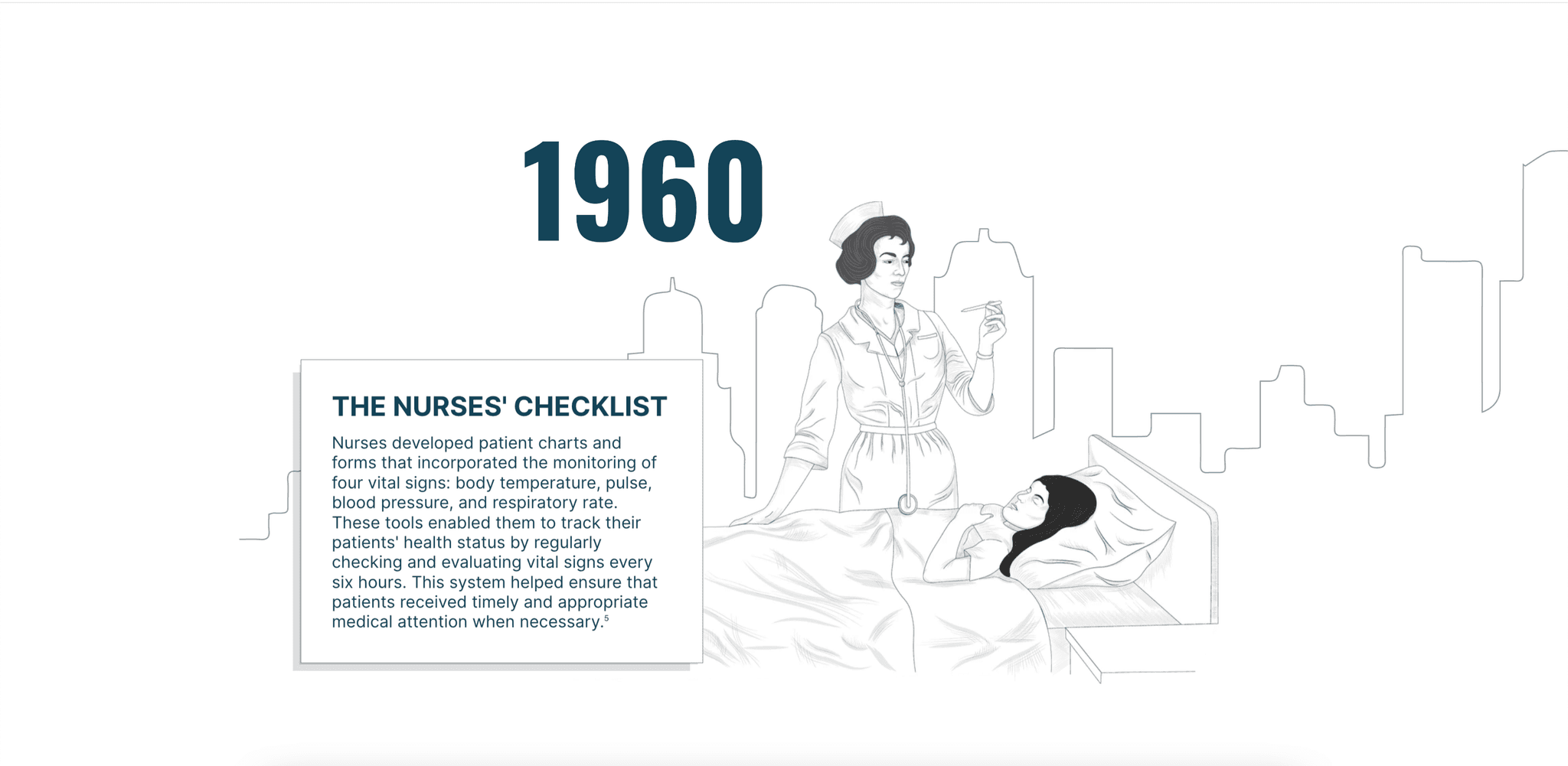
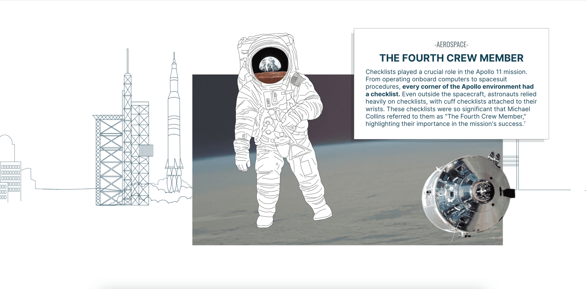
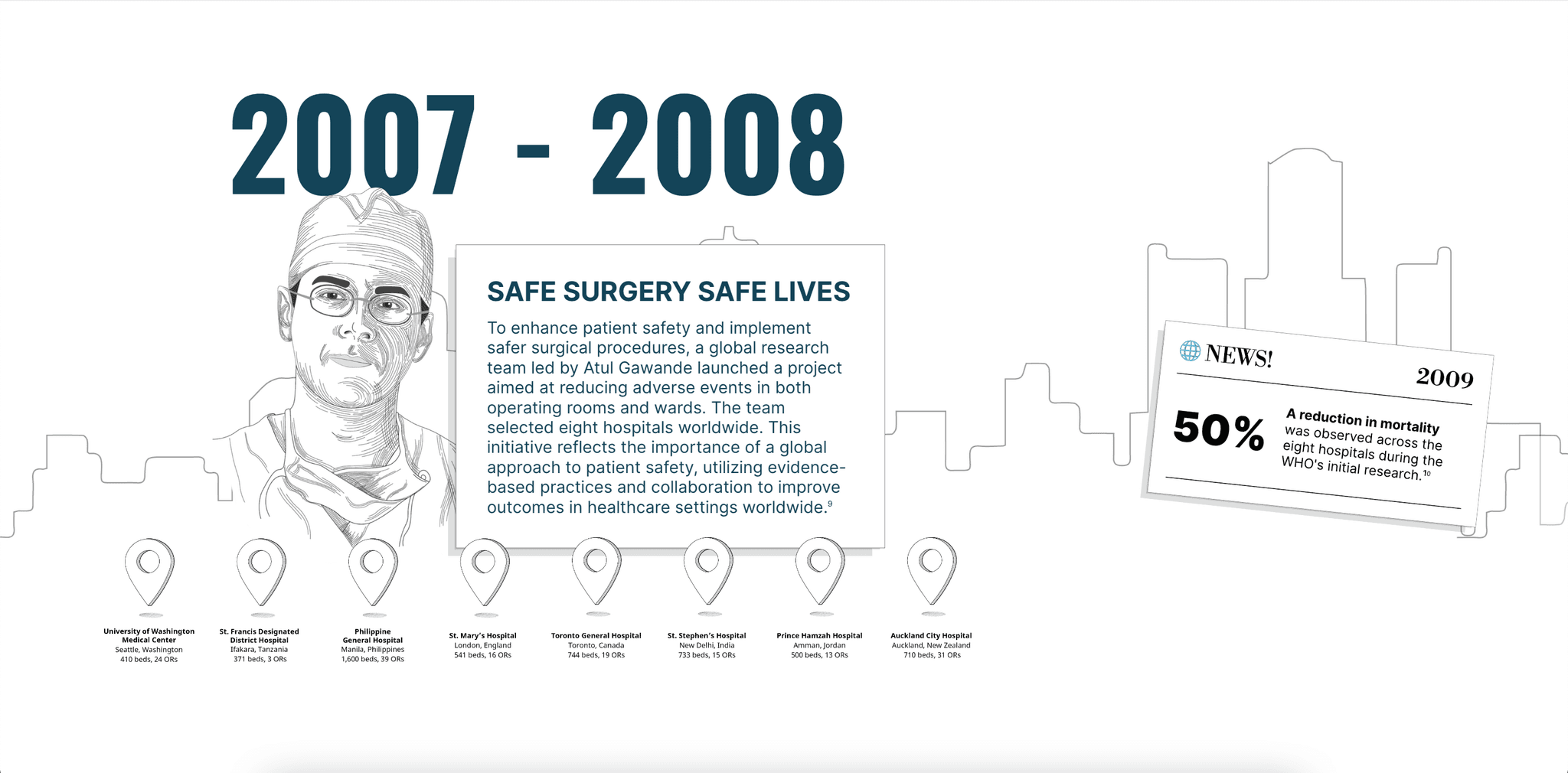
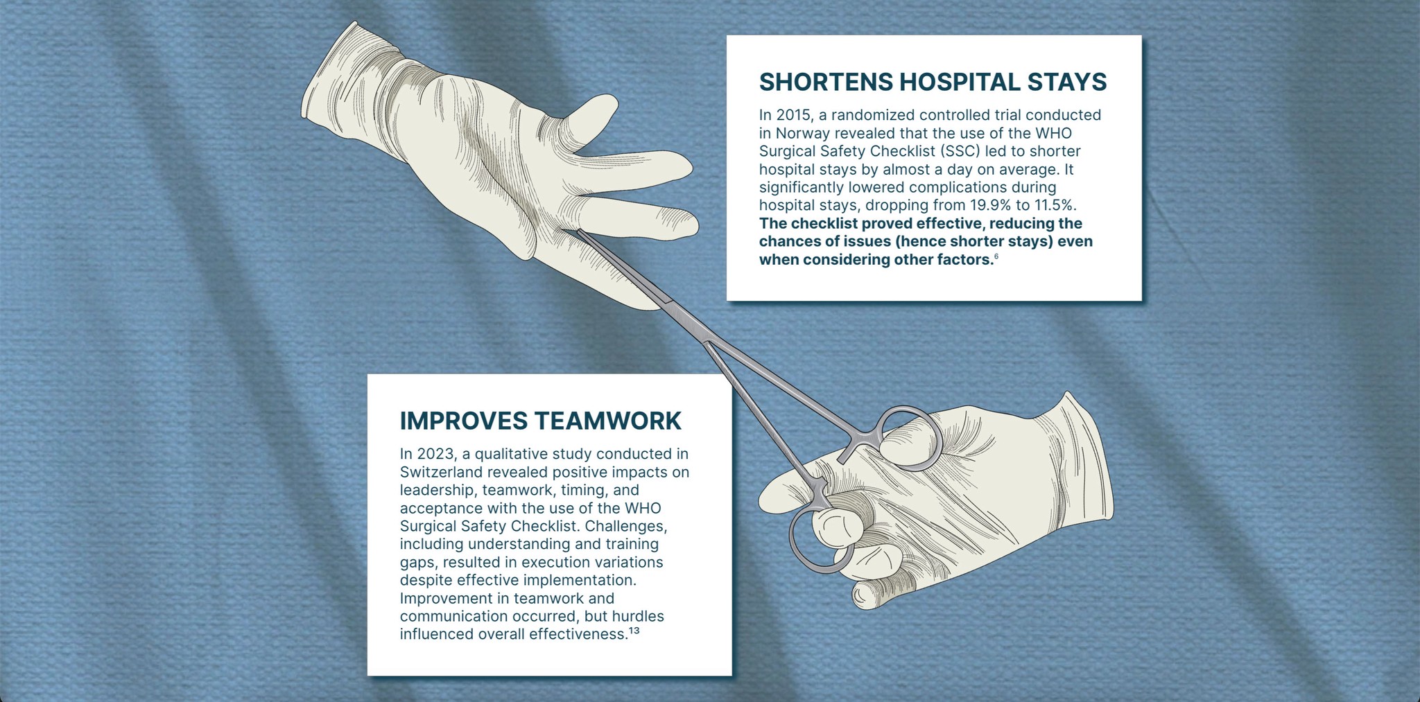
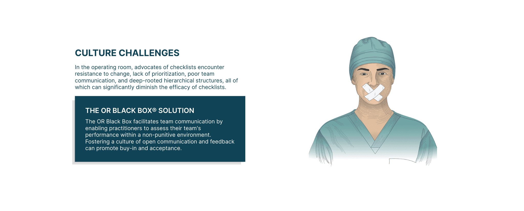
In this phase, we focused on defining and creating the microsite's style and aesthetic. We chose a combination of hand-drawn and cut-out photographs to give the site a visually creative and experimental feel. Each visual element was carefully curated, sourced, or produced in-house to ensure coherence. This approach allowed for captivating animations and combinations to engage visitors effectively.
Phase 3 - Bringing It Together
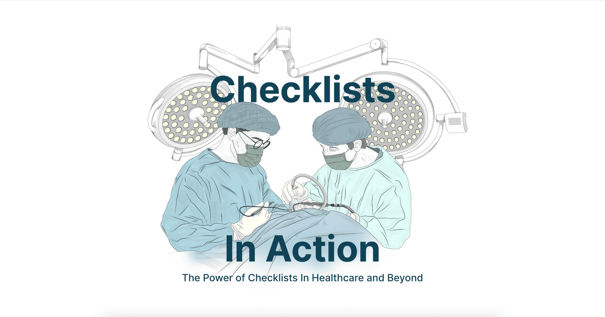
The typography and minimalist aesthetic maintain alignment with the main corporate site while featuring a distinct visual treatment. Colors are subdued, shadows are crosshatched, and lines are crisp, offering a refined yet unique look that sets it apart.
