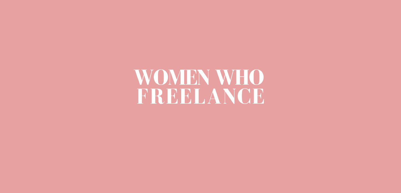
BRANDING
Women Who Freelance
A branding project for a women's freelancers community in Canada
Context & challenge
Women Who Freelance is a growing community and directory dedicated to supporting women of diverse skillsets to confidently build and grow their freelance businesses. I was engaged to do their rebrand, which included redesigning their logo, brand colours and typography.
The challenge was to refresh a well-established brand without straying too far from its original identity, ensuring brand familiarity while introducing a fresh, standout aesthetic that would help the community distinguish itself.
Moodboards


Process
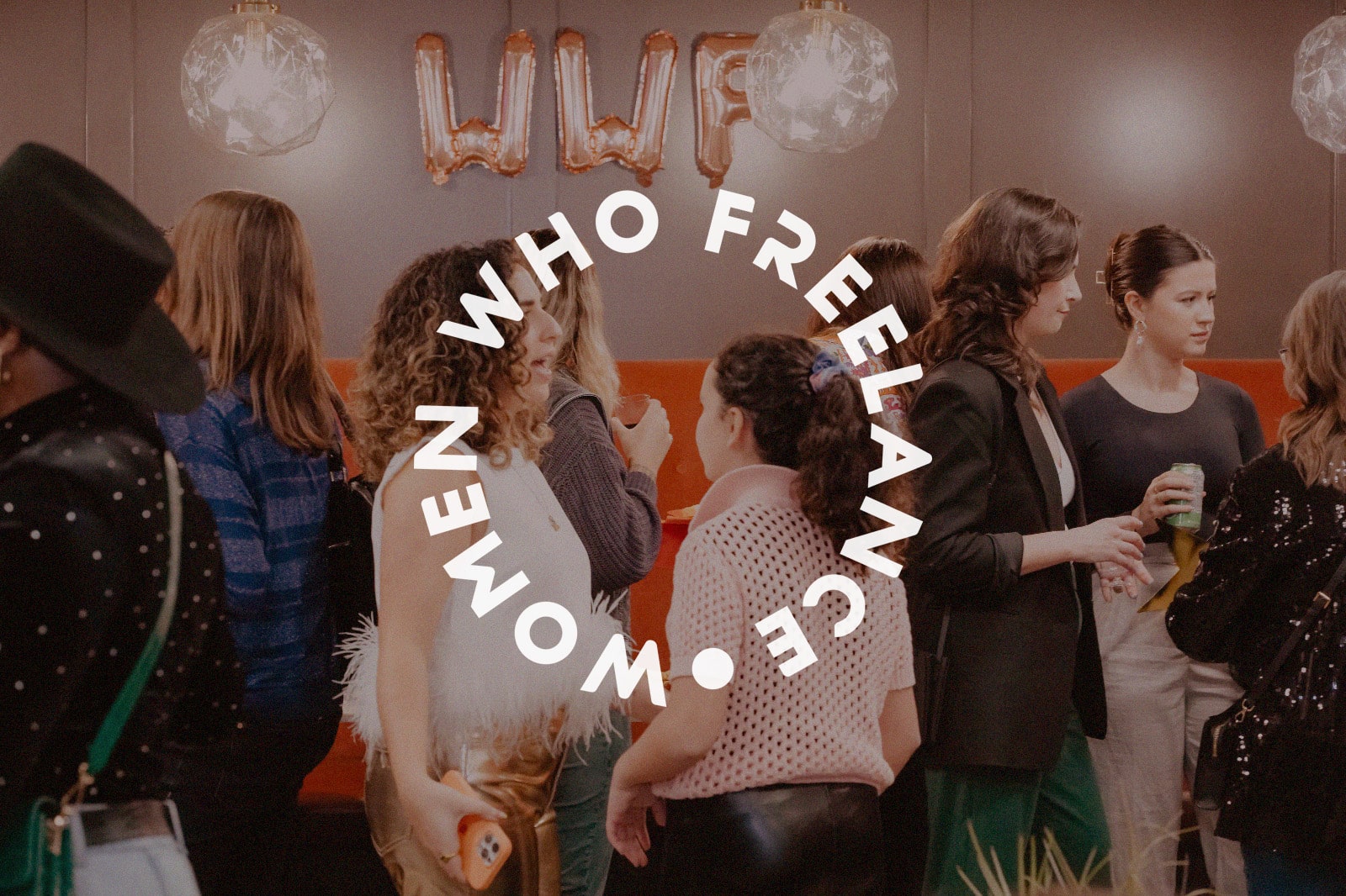
The brief asked for simplicity and still reference the old logotype, hence I chose to go for a type-based logo that still felt familiar. A nice addition was a circular logo mark that could be used on assets, the website and other collateral.
A more vibrant shade of pink was chosen to elevate the look and feel of the brand along with shades of green. Together, these colours can create a welcoming, positive, and uplifting atmosphere, making it ideal for a brand focused on community, creativity, and empowerment.